UX DESIGN & IMPLEMENTATION
Twinshot Coffee
COMPANY
TwinShot Coffee
ROLE
UX | UI Designer
EXPERTISE
Web Design
YEAR
2025

Project description
Twin Shot Coffee is a mobile espresso bar in Los Angeles whose website worked against the business it represented. The menu sat locked inside an image, the contact form asked for an address but never the event, and eight thin pages diluted a simple decision. I approached this as an end to end experience problem rather than a visual refresh, following the planner's journey from first scroll to sent inquiry and rebuilding the system underneath it so every screen, state, and breakpoint traces back to one source.
Challenge
How might we redesign the whole booking journey, from first impression to sent inquiry, so a planner can judge the drinks, understand what a package includes, and reach out inside a single page that feels as considered as the cart showing up at their event?
Approach
Audit and research first, then information architecture, wireframes, and a design system extracted from real values rather than invented. Usability testing fed changes back into the file, and the same components carry the experience across desktop, tablet, and mobile so the system proves itself at every width.
Timeframe
From explorations to final designs in 3 weeks while working with multiple projects at the same time.
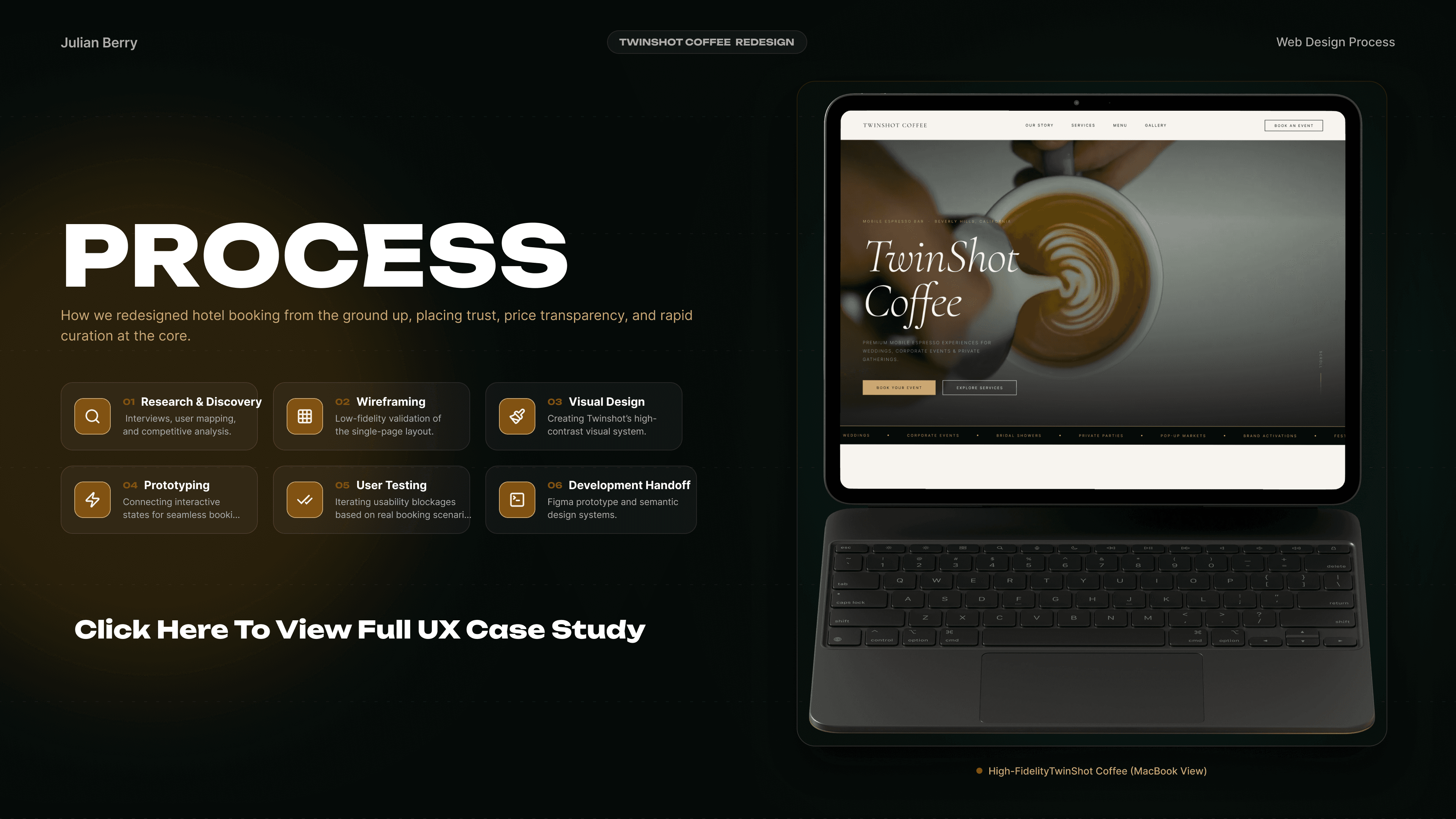
Process
Interviews and a screener survey showed that people judge a coffee cart by its drinks first: seventeen of twenty three went looking for the menu before anything else, and eleven gave up on the old image menu on their phones. Competitive analysis of Los Angeles carts found real menus but almost no event specific forms, no pricing signals, and no single page flow. Ideation converged on one scrolling page where four small menu tabs carry the whole drink list in real text, each item labeled Included or Add on. Prototypes paired that with an inquiry form built as an event brief. Usability testing caught mobile tabs sitting under the touch target floor, so I rebuilt them at forty five pixels and widened the carousel controls to match.
Research & Planning
Ran a screener survey and interviews with event hosts and planners, then audited the old site against competing Los Angeles carts. Gaps clustered around an unreadable menu, a form that ignored the event, and no signal of what a package includes. Personas and journey maps set the priority order.
Design & Prototyping
Reconstructed wireframes at desktop and mobile widths to test the single page flow, then built the interface from a design system extracted from real values rather than invented ones. Iterative testing sharpened the menu tabs, the labels, and the inquiry form.
Development & Implementation
Built the live site and rebuilt it as a component driven Figma system, so every screen is an instance rather than a one off. Prioritized accessible contrast, forty four pixel touch targets, and true reflow across desktop, tablet, and mobile for planners booking from a phone.
Solution
The redesign brings the whole decision onto one scrolling page. Four menu tabs hold every drink in real text, each labeled Included or Add on, so a planner can size up a package without asking. The inquiry form works as an event brief, collecting type, guest count, date, and vision in one pass. Anchored navigation keeps a booking action a click away at any scroll depth, and the same components hold the layout together across desktop, tablet, and mobile.
Tabbed Drink Menu
Every drink lives in real text across four tabs, Espresso, Specialty, Cold, and Non Coffee, each item carrying its build notes and one honest label, Included or Add on. A planner learns what a package covers before sending a single message.
Event Brief Inquiry
The contact form asks what actually matters: event type, guest count, date, and a free field for vision and special requests. Inquiries arrive already qualified, so the first reply can quote a real package instead of asking another round of questions.
Anchored One Page Flow
Navigation jumps to sections rather than pages, and a booking action stays within a click at any scroll depth. Nothing dead ends, so a visitor can move from first impression to sent inquiry without ever losing their place on the page.


What Changed
Three shifts carry the redesign. The menu stopped being a picture and became information. The contact form stopped being a formality and became the first step of a quote. The site itself stopped being a set of pages and became a system that holds together at every width.

From Image to Information
A photograph of a printed card became four tabs of real text, each drink carrying its build notes and an honest Included or Add on label. Readable on a phone, indexable by search, quotable in conversation.
From Form to Event Brief
Address and Subject gave way to event type, guest count, date, and vision. The same field count now does qualifying work, so a first reply can carry a real package instead of more questions.
From Template to System
Eight thin pages became one page built from components: eight color tokens, thirty five text styles, and a single set of parts driving desktop, tablet, and mobile from one source of truth